Have you ever wondered how you can build a unique sleeve without planning one big image from the start?
Patchwork designs let you add art over time and keep each piece visible. You place separate tattoos with intentional space between them so every design reads on its own.
You’ll learn how a patchwork tattoo differs from a full sleeve and why people choose this approach. The look feels like a curated collage or sticker effect, and it works well when you pick a consistent tattoo style or palette.
This short guide gives clear examples and planning tips so you can add one tattoo at a time, avoid overcrowding, and keep your body art readable and meaningful.
Key Takeaways
- Patchwork keeps each tattoo distinct by using visible gaps.
- You can build a cohesive look with a shared style or color palette.
- The approach lets you add new pieces over time without a full plan.
- Use spacing and size to prevent overcrowding and preserve readability.
- Talk with your artist about placement to support long-term balance.
What patchwork tattoos are and why they’re trending right now

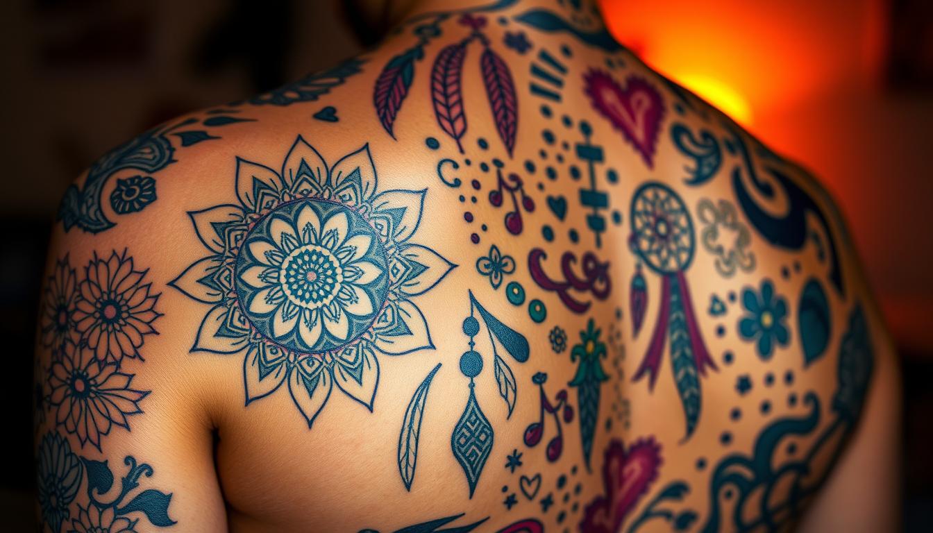
Many people now treat their body art like a curated collage, adding distinct pieces over time instead of planning a single continuous image. This placement method lets you mix styles and keep visual gaps so each design reads on its own.
Placement, not style: A patchwork approach is about where you put each tattoo, not which tattoo style you choose. You can combine traditional, illustrative, or modern blackwork and still keep the concept intact.
The visible gaps — deliberate negative space — are key. Leaving open skin between pieces makes each design act like a sticker. Some people add subtle fillers such as mist, stars, or tiny swirls. Others prefer pure contrast.
Quick example and tips
- Start with a few favorites and plan surrounding space before you add more.
- Use anchors (larger pieces) and then fit smaller art around them.
- Keep gaps consistent so the layout looks intentional as it grows.
| Gap Style | Common Fillers | Effect |
|---|---|---|
| Open skin | None | High contrast, sticker look |
| Light shading | Smoke, mist | Soft cohesion |
| Iconic fillers | Stars, webs, swirls | Playful ties between pieces |
Patchwork tattoos vs. traditional sleeve tattoos

One arm can tell a single story or host many small stories; the choice changes how people see your body art. Your decision affects flow, upkeep, and how each piece reads from a distance.
Flowing, cohesive sleeves use continuous backgrounds and transitions. A traditional tattoo style often ties images together with shading, banners, or linked motifs so the whole sleeve reads as one scene.
Separated “sticker” designs — a patchwork sleeve — leaves visible gaps and lets each design stand on its own. You can mix themes and tattoo style freely without forcing a single narrative.
How they differ in practice
- A classic tattoo sleeve emphasizes a single theme and large visual impact.
- A patchwork sleeve highlights readability and modular growth; adding one new piece later is easy.
- Traditional sleeves minimize negative space; separated designs embrace open skin as part of the look.
| Feature | Traditional sleeve | Patchwork sleeve |
|---|---|---|
| Theme | Single narrative | Multiple interests |
| Backgrounds | Common, linking elements | Minimal or none |
| Maintenance | Harder to change | Easier to add or swap one |
How to start a patchwork sleeve you’ll love long-term

Begin with a couple of small tattoos you really want. Choose pieces that matter and place them on your arm or leg so they breathe. This helps you start patchwork without committing to a full layout.
Decide early on color or black and gray. That choice sets the tone and makes future additions easier to match. Both approaches work well for a sleeve if you keep the palette consistent.
Size strategy matters: place one or two slightly larger anchor pieces first, then plan where smaller tattoos will fit. Use paper cutouts or a digital mockup to test spacing near joints.
Practical steps to plan and pace
- Map how you’ll start filling open skin so the layout stays clean.
- Work with a trusted tattoo artist to sketch a loose template for symmetry and balance.
- Give yourself healing time between sessions so swelling settles and you can judge distances.
- Save key areas for future anchors or meaningful designs; flexibility keeps options open as you grow the sleeve.
Treat the process as a living guide. Over months and years, each addition should improve flow without crowding. That patient approach makes a long-term sleeve feel intentional and personal.
Design rules of thumb that keep your sleeve cohesive
When you set clear visual rules, separate pieces begin to work together naturally. A few small choices in line, contrast, and palette will keep the whole composition balanced as you add new work.
Pick a tight family of styles
Lock in a tattoo style family — like traditional tattoo, neo-traditional, or illustrative — so line weight and shading match across pieces.
Consistency in approach helps different subjects sit side-by-side without clashing.
Use color or commit to black & gray
Choose a consistent color palette or go full black gray. That single decision unifies varied imagery and makes each piece feel planned.
“Many strong examples maintain cohesion through line work and color harmony.”
- Make sure anchors and smaller work share similar contrast so nothing looks washed out.
- Use repeating elements—borders, dotwork, or motifs—to create subtle rhythm across the layout.
- Balance saturation: spread color density so one area doesn’t overpower the rest.
- Pick a loose theme (botanical, nautical, folklore) if you want added cohesion without losing freedom.
- Rehearse placement with your artist and revisit the plan periodically to keep the look great as you grow the sleeve.
Mastering negative space: gaps, fillers, and flow

A few well-placed voids guide the eye and keep each design bold and readable. Leaving skin between pieces is the signature move for this approach. You can soften gaps or preserve sharp edges depending on your goal.
Intentional spacing: how much skin to leave and where
Decide how much space to keep so borders stay crisp and each design reads from conversational distance. Leave extra room near joints and high-movement zones where skin can compress.
Smart fillers: stars, webs, swirls, or smoky effects
Minimal motifs—tiny stars or swirls—unify nearby pieces without overwhelming your layout. Light smoky or misty shading softens gaps while keeping individual art visible.
High-contrast options and gentle visual paths
Selective blackwork can add boldness, but avoid heavy fills that blur edges. Map subtle diagonal or vertical paths along the arm to guide the eye without creating a single background.
- Start filling in a test area and evaluate the healed result before repeating the method.
- Match filler line weight to nearby work to keep a consistent style.
| Filler | Best Use | Effect |
|---|---|---|
| Open skin | Sticker look | Maximum contrast, readable pieces |
| Stars & swirls | Small connectors | Playful ties, low visual weight |
| Smoke/mist | Soft cohesion | Blends gaps, keeps edges clear |
| Selective blackwork | Bold anchors | High contrast, avoid muddying borders |
Style ideas and themes that look great in patchwork
Use a larger anchor first—pick a standout piece like a panther, eagle, or floral cluster. That anchor gives you a visual home and helps you place smaller work so the arm reads balanced.
American Traditional and classic motifs for a timeless look
American Traditional relies on bold outlines and a limited palette. That shared language makes varied motifs feel cohesive, so different subjects look like they belong together.
Black & gray realism and botanical/animal themes
If you prefer subtlety, go black and gray. Consistent shading and subject choice—plants or animals—create a refined thread across the sleeve. Artists like FXBLD show how black-only sets stay unified.
Mix-and-match examples: small tattoos around larger anchors
- Start with one large piece, then add small tattoos that echo its line weight or color.
- Create a loose theme—flora and fauna or nautical icons—to tie different designs together.
- Study work by Alex Duquette for classic motif placement and spacing.
Keep an inspiration folder and refine ideas with your artist so each addition helps the overall composition and makes the sleeve look great.
Working with a tattoo artist to map your patchwork
A mapping session with a skilled artist helps you place anchors, check symmetry, and save breathing room. Start by bringing a shortlist of reference images so your tattoo artist can translate ideas into a balanced plan for the part of body you’re filling.
Planning templates for symmetry, sizing, and placement
Co-create a template that marks anchor locations first, then plots smaller designs to fill remaining space. Use stencils, temporary transfers, or digital mockups to preview how each piece sits on your arm or leg.
Making sure each tattoo stands alone and still fits the sleeve
- Confirm spacing so lines don’t crowd when healed.
- Ask your artist to adjust scale to match body curves and neighboring work.
- Schedule sessions with time between them so you can judge healed spacing before more tattoos are done.
- Keep a simple map of what’s done and what’s next, and revisit the plan as the sleeve grows.
| Step | How to do it | Benefit |
|---|---|---|
| Reference shortlist | Bring images and notes | Speeds artist planning |
| Template mapping | Block anchors, mark gaps | Maintains symmetry |
| Test placements | Stencils or digital mockups | Checks scale and spacing |
| Session timing | Allow healing between sessions | Lets you confirm final look |
Conclusion
A clear plan and steady pacing turn separate designs into a cohesive, intentional sleeve. Use spacing, a simple template, and a consistent palette so each piece reads on its own as you add ink over time.
People like this approach because it lets one part of your body show many interests without forcing a single story. Whether you favor bold traditional motifs or black and gray realism, keep lines clean and contrast balanced.
Work with your artist, allow proper healing between sessions, and revisit your map as more small tattoos are done. Follow this guide, start patchwork at your pace, and enjoy building a sleeve that truly reflects your art and taste.