Have you ever wondered why a nearly invisible mark can feel so intentional and personal?
We’ve seen white ink rise as a minimalist way to wear body art, offering a lace-like, ethereal effect that reads softly on the skin. Many choose this subtle approach to test ideas, add delicate highlights, or expand a collection without bold color.
In this guide, we’ll explain how white ink behaves in different skin tones, why ink choice and an experienced artist matter, and what to expect during healing and years of wear. We’ll also cover how small white outlines can brighten color pieces and how to set realistic expectations.
Our goal is practical: we bring working-artist insights and clear steps—like testing patches and reviewing healed photos—so we can decide confidently before booking a session.
Key Takeaways
- White ink creates a subtle, minimalist look that appeals to both first-timers and collectors.
- Contrast varies by skin tone; fair-to-medium skin often shows more detail.
- Artist technique and quality ink influence longevity and vibrancy.
- Expect modest visibility, careful aftercare, and gradual change over years.
- Test patches and healed photos help us make informed choices.
What Are White Tattoos and Why They’re Trending Now
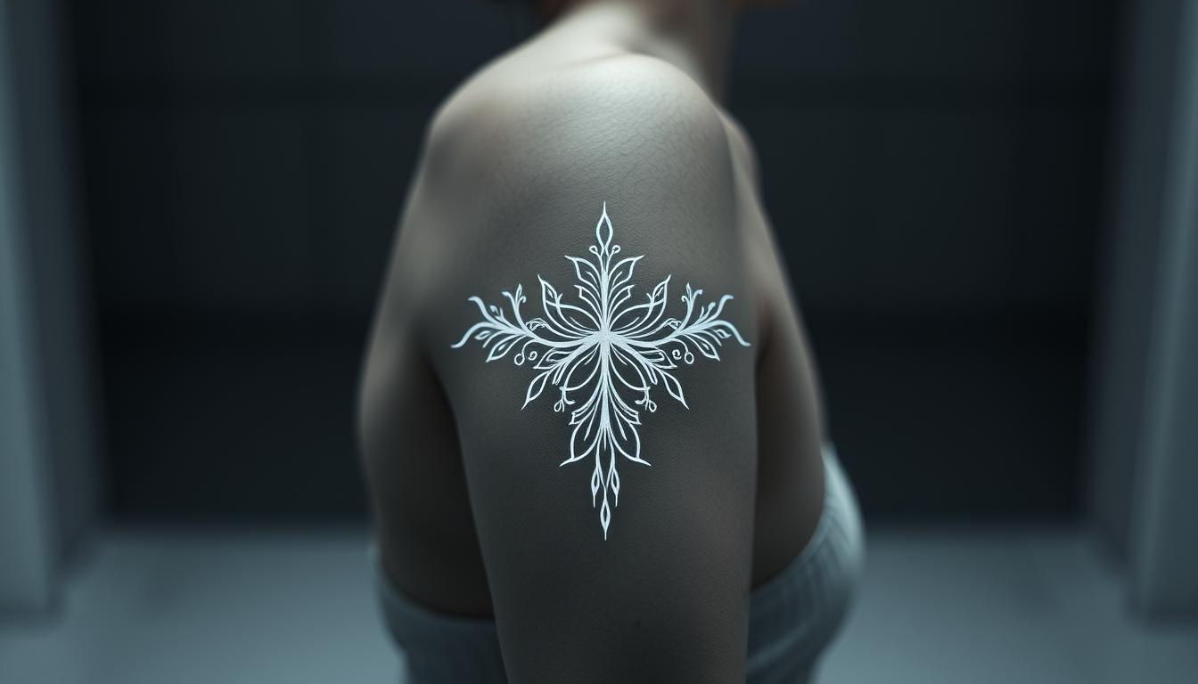
A subtle form of body art uses pale pigment to produce a lace-like, etched look that feels intimate and refined. We define these designs as pieces executed mainly with white ink, giving a soft, low-contrast result compared with bold black or vivid color work.
Why the surge? Many clients want a discreet way to express themselves. These marks often suit lighter skin tones best, where contrast can reveal fine lines and delicate shading.
Minimalist appeal and ethereal aesthetics
Small symbols, fine lines, and lace patterns complement the soft finish of this ink. The aesthetic reads as personal and workplace-friendly, which helps explain its popularity.
How pale ink differs from black and color work
Compared with black or strong color, this ink photographs differently and ages with less stark contrast. On medium skin the look can be more delicate, and on deeper skin it may be very subtle or nearly invisible.
- Design fit: fine-line pieces and small highlights work best.
- Visibility: noticeable up close, understated at a glance.
- Maintenance: lower contrast means occasional touch-ups keep edges crisp.
| Feature | Pale Ink Result | Black/Color Result |
|---|---|---|
| Contrast on lighter skin | Higher, crisp detail | Very high, bold detail |
| Workplace visibility | Low to moderate | High |
| Ideal designs | Fine lines, lace, tiny symbols | Bold lines, color fills, shading |
| Maintenance needs | Touch-ups likely over years | Less frequent for strong pigment |
How White Ink Works in Skin
Where the pigment sits and how our skin filters light decide most of the visible outcome. We’ll break down why delicate ink can read so differently on various tones and over the years.
Placement in the dermis and how skin tones filter color
Tattoo pigment is deposited into the dermis, where the body encapsulates particles so they stay long term. That process is the same for all ink, yet how our skin looks above the ink changes what we see.
Melanin acts like a natural filter: deeper tones often obscure lighter hues, while very fair skin can reveal fine lines more clearly.
Why it can resemble scarification on lighter skin
On fair skin, thin pale lines often reflect light in a way that mimics healed scars from a distance.
“Up close you can tell the mark is ink; from afar it may read as raised or faintly pale,” artists note.
This optical effect is about contrast and texture, not a different material in the skin.
When a design looks subtle versus nearly invisible
Small shifts in tone, placement, and lighting change perceived visibility. We find that contrast loss—not uniquely fast pigment breakdown—explains most apparent fading.
- Preserve brightness: sunscreen and limiting sun exposure matter over years.
- Expect variation: aftercare, skin biology, and placement shape results.
White Tattoos and Skin Tones: Making Contrast Work for You
Not all skin tones reveal pale work the same way; contrast is the deciding factor. We want realistic expectations so our design still feels meaningful after healing.
Lighter skin tones: where it shines
On lighter skin tones, white ink often reflects more light. Fine lines and lace-like details read clearly and look crisp up close.
Artists note that translucency helps brightness, so delicate marks keep their shape when placed on fair or light-medium areas.
Medium to deeper tones: realistic expectations and alternatives
On medium to deeper tones, pale pigment may heal softer, creamy, or nearly invisible. That outcome is normal because melanin filters lighter hues.
Alternatives include using bold black shapes, strong graphic lines, or sparing highlights to add contrast and lasting definition.
Testing patches to make an informed decision
We recommend a small test patch and full healing before committing. Wait several weeks so we can judge the true tone shift in our own light.
“Do a tiny tester, then live with it—photos after full healing tell the real story.”
Design Inspiration: Lines, Highlights, and White-Only Concepts

We favor minimal, architectural sketches when planning pieces that will sit subtly on skin. Simple shapes and careful spacing keep fine line work readable after healing.
Fine motifs and delicate symbols work well as standalone ideas. Lace-like patterns, tiny icons, and single-line florals read as jewelry on the body.
Pinpoint highlights that lift color
Pinpoint accents add shine to color elements. Small dots on fruit, tiny hair gleams, or glossy highlights on petals make a piece pop.
Glow outlines and outside-the-outline effects
A soft perimeter around darker areas creates an ethereal halo. We often heal an outline first, then add color later to keep that edge crisp.
Overlaying and contrast refresh
Selective overlays can sharpen old work. Thoughtful placement of pale ink refines edges and brings subtle dimension.
| Technique | Use | Benefit |
|---|---|---|
| Fine line-only | Lace, symbols | Delicate, jewelry-like look |
| Pinpoint highlights | Color accents | Adds sparkle and realism |
| Outside outline | Halo effect | Separates design from skin |
Choosing and Knowing White Ink: Brands, Opacity, and Consistency
Choosing the right pigment changes how a delicate design sits and lasts on our skin.
Artist-favorite formulas include Eternal White Ink, Fusion White Ink, and Solid White Ink. These brands are praised for bright, consistent mixes that help small line work read clearly.
Why opacity and pigment load matter
Opacity and pigment load decide whether a fine line holds shape after healing. Thicker pigment helps edges remain visible, while thin, watery mixes can blur or thin out.
Reading reviews and trusting experience
We always review healed photos, not just fresh shots. Healed results show how a formula behaves on different skin tones and over time.
- Ask the tattoo artist which brand they use and why—it matters more than a label.
- Check shop storage and supplier reputation; proper handling preserves consistency.
- Compare healed portfolios to spot patterns in longevity and tone shift.
“The best ink is the one our artist knows well and can apply cleanly to our design and skin.”
Technique Matters: Keeping White Ink Clean and Bright

How we handle needles, caps, and rinses decides the final brightness of delicate ink. Small choices in the shop add up fast.
Clean gear protects contrast and prevents unwanted tinting. We ask for fresh or fully rinsed needles and separate caps reserved for pale pigment.
Clean needles, rinsing between passes, and dedicated caps
Use fresh needles or rinse thoroughly between passes so no residual color migrates into fragile lines. Dedicated caps for pale pigment stop cross-contamination.
Disposable tubes versus metal hardware
Many pros prefer disposable tubes over metal. Metal-on-metal friction and old hardware can introduce graying. Disposable options reduce that risk.
Preventing gray contamination and stencil care
Let the stencil set and wipe it lightly. Heavy scrubbing or wet transfer can push purple dye into pale lines and dull the result.
- Slow, steady linework and measured passes keep edges crisp without overworking skin.
- Separate caps and clean rinses prevent residual pigment from tainting delicate areas.
- Discuss setup with our artist before the session so we agree on process from start to end.
“Insufficient rinsing or the wrong hardware is the most common cause of a dull finish.”
white tattoos: Pros, Cons, and Who They’re Best For
Choosing a subtle pigment asks us to weigh visibility, healing quirks, and long-term care. We want pieces that feel personal yet fit daily life.
Subtle aesthetics and workplace-friendly visibility
Pros: quiet designs read as refined jewelry. Small marks keep workplace visibility low while still delivering a personal statement.
Limitations: visibility, potential yellowing, and uneven healing
Cons: on some skin tones a mark can be nearly invisible. Healing may be uneven, and over years light areas can shift toward a creamy or yellow tone.
- Use sunscreen and careful aftercare to limit sun damage and slow white ink fade.
- Expect possible touch-ups; many artists plan maintenance into the process.
- Consider alternatives like subtle black line work or small highlights if permanence matters more than subtlety.
Who benefits most: people who want discreet style, accept upkeep, and will test a patch or review healed photos to make informed decision.
Can You Use White Over Black Ink?

Layering pale highlights over dark work can give a design a luminous edge without trying to cover the base. We can add targeted light accents to lift shadow, sharpen edges, or create a soft halo that reads as depth on the skin.
When overlays add dimension
Selective pale lines or dots on top of black shapes can act as highlights. These touches catch light and add contrast that makes elements feel three-dimensional.
Age of the black tattoo and realistic results
Older black ink that has settled and faded accepts light accents better than a fresh, saturated piece. If a black tattoo is several years old, the ink sits more evenly in the dermis and small highlights read cleaner.
- Expect refinement, not cover: overlays brighten and define rather than erase dark areas.
- We recommend a consult to map where using white ink will help based on how the black has aged.
- Start with a conservative pass, heal, then reassess before adding more.
“A practiced artist and careful technique are the difference between a crisp highlight and a muddy result.”
Pain, Time, and Session Strategy
The last minutes of a session—when small pale details are added—can feel sharper to clients. We explain why that happens and how to plan.
Why it can hurt more: many people feel highlights more at the end because the skin is already sensitive and we are tired. The sensation is about accumulated irritation, not a different pain from the pigment.
Why end-of-session highlights seem intense
Fine work uses tiny groupings and repeated passes to gain opacity. Those small passes can rub tired skin and feel sharper.
Multiple passes, small needle work, and session planning
We save pale details for last to avoid cross-contamination and protect bright results. Ask for breaks and agree on pacing with your tattoo artist so the session fits your comfort level.
Aftercare timing matters: plan travel and exercise so we can follow aftercare without rushing. Calm, methodical technique helps produce brighter outcomes with less irritation.
| Factor | Why it matters | Practical tip |
|---|---|---|
| End timing | Skin sensitivity increases | Save highlights for last, allow breaks |
| Multiple passes | Needed for opacity | Use short passes, rest between |
| Contamination risk | Dark pigment can taint pale ink | Dedicated caps and final placement |
“Talk openly with your artist about pace and comfort—it’s the best way to get a bright result with minimal irritation.”
Healing and Aftercare: From Puffy to Polished

Healing can make pale marks look louder than they will after months of settling. Early swelling, redness, and a raised, 3D look are common and usually temporary.
Raised/3D look during healing and what’s temporary
Right after a session the area may puff and shine. That sculpted appearance often fades as the skin calms and scabs shed.
On lighter skin the contrast can feel intense at the end of week one, but the final tone softens by the full healed stage.
Aftercare products, gentle cleansing, and patience
We cleanse gently with mild soap and pat dry. Use thin layers of a recommended balm to keep the dermis hydrated without suffocating it.
Avoid heavy creams, friction from clothing, and sun exposure while the skin repairs.
Touch-ups, maintenance, and protecting delicate lines
Uneven healing or gray tint from contamination can often be fixed with a targeted touch-up. We wait until full healing—usually several weeks—before assessing the need.
Long-term care means sunscreen and occasional maintenance to keep fine lines crisp for years.
“Fully healed outcomes—not day three—show the true result.”
Longevity, Sun, and Lifestyle: Will White Ink Fade?
How our skin meets sunlight and care routines decides whether fine ink stays crisp or softens. This section explains practical steps that help maintain subtle work over months and years.
Sunscreen, sun exposure, and the “driving arm” effect
Sun is the biggest driver of visible fading. Daily SPF on exposed areas markedly preserves contrast and helps prevent a premature loss of brightness.
Tip: apply broad-spectrum SPF to arms and hands every morning. The “driving arm” often fades faster because of routine UV exposure through windows.
How ink may age: creamy tones, subtle shifts, and fading
Expect gradual change. Many pieces soften to creamy or beige tones over time, and that shift can still look elegant on the body.
Consistent shade habits, UPF clothing, and routine moisturizing support the skin that protects our work. Over the course of several years, touch-ups can restore edges without altering the original design.
Self-tanner/DHA and topical color effects
Self-tanners darken the top layer of skin, so pale designs may read darker until the tan exfoliates away. This is temporary and reversible with normal skin turnover.
We recommend annual photo check-ins to track any white ink fade and decide if a subtle refresh is needed.
“Sunscreen and simple care deliver the biggest payoff when preserving delicate ink long term.”
- Protect exposed areas daily with SPF.
- Seek shade and use UPF clothing when possible.
- Photograph healed work yearly to judge if a touch-up will help.
Cost, Artist Selection, and Shop Prep

Budgeting for pale-ink work means more than a simple hourly rate. We should expect higher costs because artists slow their pace, rinse carefully, and often plan touch-ups. This extra care protects fine lines and keeps pigment clean in the dermis.
Why some projects cost more
Delicate work takes time. Multiple passes, dedicated caps, and reusable-free setups add labor and materials. If an ink tattoo needs careful layering to hold on our skin, the session runs longer and the price reflects that.
What to ask a tattoo artist
- Which brand of white tattoo ink do you use and why?
- Do you use disposable tubes and separate caps for pale pigment?
- How do you prevent cross-contamination when you add highlights?
- Can we schedule a short test patch before a full piece?
Portfolio review: healed work matters
We focus on healed photos, not fresh shots. Look for crisp fine lines, real contrast on skin, and consistent results from tattoo artists. Ask to see small, healed pieces and any notes on touch-ups or longevity.
| Cost Driver | What to Ask | Practical Tip |
|---|---|---|
| Extra passes & slow pace | How many sessions are planned? | Plan time, expect higher hourly totals |
| Special setup & caps | Do you use dedicated white caps? | Pick a shop with clear disposable protocol |
| Touch-ups & maintenance | Is a follow-up included? | Agree on timing for any free touch-up |
| Artist skill & healed portfolio | Can we review healed close-ups? | Choose artists with proven healed results |
“Vet a shop’s process before booking—clean stations and clear answers show the knowledge we need.”
Conclusion
Good results come from testing, choosing trusted pigment, and working with artists who know how to protect delicate marks.
Plan a small patch first, ask about Eternal, Fusion, or Solid formulas, and confirm rinsing, disposable tubes, and dedicated caps at your session.
Remember healing often looks raised before it settles, and pale ink may mellow to creamy tones over time. Older black ink accepts small overlays well, and subtle highlights can add dimension without heavy cover.
Daily SPF and gentle care are the simplest long-term maintenance. Review healed portfolios and ask white-ink–specific questions so we book with confidence.
With the right prep and a skilled artist, white ink tattoo and light highlights can feel personal, refined, and lasting on our skin.