Can a tiny mark say more than a ring? We set out to test that idea and share what resonates for us today.
We want small, meaningful ink that fits daily life and tells a quick story of our relationship. Hearts, infinity signs, puzzle pieces, and lock-and-key keep coming up. Minimalist, watercolor, and geometric styles feel fresh without shouting.
Placement matters: wrists, fingers, ankles, and behind the ear heal well and stay discreet. Costs can start near $50 and climb into the hundreds depending on size, shading, and the artist’s reputation. We review portfolios, check hygiene, and ask questions before booking.
Aftercare is simple but crucial: clean gently, moisturize, avoid soaking, use SPF once healed, and don’t pick scabs. We’ll also cover pain expectations and artist collaboration so our tiny marks age with care.
Key Takeaways
- Tiny designs can carry deep love and meaning if matched to personal stories.
- Popular symbols—hearts, infinity, puzzle pieces—work well in minimalist or watercolor styles.
- Common discreet placements include the wrist, finger, ankle, and behind the ear.
- Budget varies: expect $50 to several hundred dollars based on artist and detail.
- Choose an artist by portfolio, hygiene, and a clear consultation.
- Follow basic aftercare to protect lines and color for years.
Why Tiny Couple Tattoos Work for Married Partners Right Now
Tiny marks can act as daily anchors, reminding us of shared moments and quiet promises. We choose compact designs because they foreground the story, not the size. That makes the content feel personal and enduring.
Shared meaning over size:
Shared meaning over size: how small ink carries big love
We find that matching tattoos act as a permanent reminder of commitment and shared experience. A micro tattoo can hold meaning equal to larger work. It also shortens session time and eases healing.
“Meaning leads; minimalism follows — our ink reads like a quiet promise we carry every day.”
Present-day trends we’re seeing in the U.S.
Right now, the world of couple tattoos favors clean, modern looks. Minimalist linework, watercolor washes, and geometric accents top the list.
- Minimalist linework with micro color for a modern finish.
- Watercolor washes for soft personality without bulk.
- Geometric halves (circles, triangles) that fit together.
- Complementary motifs — lock & key, puzzle pieces, infinity — that read as unity.
These trends let us pick matching, mirrored, or complementary designs that suit our routines, wardrobe, and how we show love. The result feels current and timeless at once.
Husband wife married couple couple tattoos small

Our goal is a design that feels natural on the body and true to our history.
Where to place tiny ink: We like wrists, inner arms, ankles, behind-the-ear spots, and fingers for everyday wear. Each place reads differently in work and social settings, so we match location to lifestyle.
Finger tattoos can fade faster because hands see constant use. We plan for touch-ups and simpler linework there to keep things crisp.
How we tailor the design to our story and style
We decide whether to get matching micro designs or complementary halves that align when we hold hands. Personal details—like a city skyline or a meaningful date—help guide the motif.
“Clean lines, legible scale, and intentional spacing keep tiny ink readable for years.”
- Try temporary versions first to test place and feel.
- Map placement to daily routines and wardrobe.
- Be honest about upkeep—especially for finger and hand ink.
For more idea starters and visual examples, we review curated galleries such as tiny design inspiration.
Mini Matching Designs: Classic Symbols That Never Miss
We lean on timeless motifs because they read clearly and age gracefully on the skin. Classic icons give instant meaning without fuss. They work well for our shared story and require fewer needle passes, which is gentler on sensitive areas.
Why choose classics?
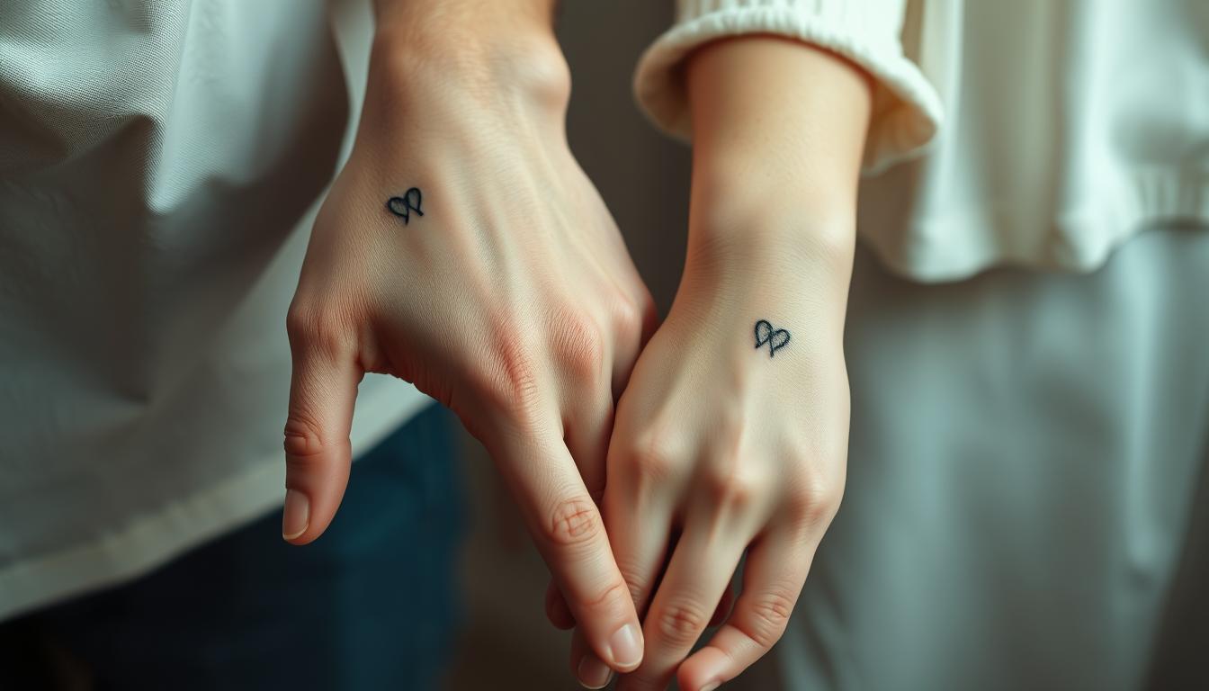
Outlined or hand-drawn hearts, infinity loops, lock & key sets, and puzzle pieces make excellent choices. These symbols keep lines clean and remain legible at micro scale.
- We love simple heart outlines or sketchy fills that feel personal and sweet.
- The infinity motif pairs nicely with a tiny “To infinity…” split across two wrists.
- Lock and key or love locket halves let each of us carry a unique part of the story.
- Puzzle pieces need crisp linework so the fit looks clear when our prints align.
“Classic motifs read well, heal faster, and keep our marks timeless.”
Pair icons with a minimal date or initials for unmistakable meaning. Choose matching or complementary versions based on how casual or formal our daily life is. Clean strokes, steady spacing, and subtle color washes keep the final design elegant and lasting.
Words, Dates, and Letters: Simple Scripts With Big Impact

A tiny phrase or a memorable date can act like a secret bookmark in our life story. We choose text when we want clarity: short, readable lines that hold meaning without fuss.
Popular scripts include “Always and forever,” “Soulmates,” and split “LOVE.” We like lowercase script for a soft look, or a crisp serif for a bolder statement. Dates in Roman numerals and the playful 11:11 motif are timeless choices that read well at micro scale.
- Keep it minimalist with single words like “always” and “forever.”
- Split “LOVE” across wrists or inner arms so it becomes whole when we stand together.
- Use Roman numerals for a wedding or meeting date that ages elegantly.
- Pair initials or a one-letter mark with a tiny heart or an infinity loop for added symbolism.
“Script clarity matters—legible fonts and spacing keep our message readable for years.”
We test fonts, confirm placement on inner wrists or inner arms, and craft content that reads like us. This approach keeps the design intentional, the lines crisp, and the sentiment lasting.
Foodie-Inspired Cute Tattoos We Love Together
Food-inspired marks let us celebrate shared rituals in a playful, wearable way.
Foodie icons are a great way to mark favorite moments. We pick motifs that read at a glance and spark a smile on any day.
Avocados, cherries, pizza, PB&J
Avocado halves, cherry pairs, and PB&J slices feel lighthearted and instant. Pizza slices with a pepperoni heart add personality without crowding the linework.
Coffee and latte art, barista blend
For coffee lovers, tiny latte hearts or a cup-and-pot pairing nod to our morning routine. These designs read well on inner forearms and age nicely with crisp outlines.
Martinis and “Cheers!” moments
Martini silhouettes and clinking glasses capture date-night energy. Wrists or ankles keep the shapes legible and playful.
“Send noods” ramen bowls
“Send noods” ramen bowls bring humor. A thin-line bowl with a pastel wash keeps the design clean and colorful. We decide between matching tattoos or complementary halves—one carries the bowl, the other the chopsticks.
“Food themes age well because they are tied to shared joy.”
Cosmic, Sun, and Moon Ink for Complementary Souls

Celestial marks let us celebrate differences and shared direction with a tiny, meaningful motif. We pick sun-and-moon sets, shooting stars, or playful astronaut-to-moon pairings when we want a visual story that reads at a glance.
Why this theme works: Sun and moon symbols act as poetic opposites that highlight how our strengths balance each other. Shooting or guiding stars point to a shared path, and an astronaut tethered to a moon creates a sweet, narrative line across two wrists.
Design tips for lasting micro pieces
Keep shapes simple so the symbols stay legible. Soft watercolor gradients—sunset hues or midnight blues—add mood without blurring the lines.
- Mirror or invert placements—sun on one wrist, moon on the other—for cohesion.
- Add a tiny date or initials among the stars for a private thread of meaning.
- Match line weight across elements to ensure durability and clean healing.
“Cosmic minimalism feels modern and timeless—perfect for matching or complementary designs.”
Anchors, Crowns, and Playing Cards: Timeless Iconography
Classic icons like anchors, crowns, and playing cards read instantly and carry stories that age well on the skin. These motifs give clear meaning with minimal needle time, which we prefer for everyday wear.
Anchors and ship wheels symbolize steadiness and navigation. An anchor can stand for grounding while a wheel suggests steering through life. We like one person with a wheel and the other with an anchor for a complementary pairing.
King and queen motifs
King and queen marks feel regal without flash. Tiny crowns or K/Q glyphs work well on wrists or fingers and hold loyalty in a tidy mark.
Playing-card-inspired pairs
Playing-card icons—hearts, spades, K/Q—read at a glance and suit microline work. They stay sharp when artists simplify ornate details for small-scale execution.
- Anchors and wheels tell a story of shared direction and balance.
- Regal crowns or K/Q keep the theme subtle and personal.
- Card glyphs are ideal for crisp, low-maintenance lines.
- Placement on inner wrist, ankle, or behind-the-ear preserves legibility.
“These classic sets balance symbolism and subtlety, which is why we return to them year after year.”
We can add tiny personalization—a single initial under a crown or a micro date by the anchor—to make the content unmistakably ours. A trusted artist will help finalize line weight and style so the final design heals clean and clear.
Animal and Nature Motifs for Soft, Sweet Statements

Nature-themed marks let us carry a little wildness and calm in the same tiny space. We pick motifs that feel gentle and personal.
Butterfly and floral duos symbolize growth and change. Pair a butterfly with a single-line floral stem and split the scene between us for a poetic, minimalist effect.
Playful pets and joyful critters
Cute bunnies, dancing kittens, or tiny paw prints bring daily smiles. These read well on the wrist or ankle and offer a sweet, low-key vibe.
Sea, sand, and horizon lines
Seashells, ocean wave lines, and palm silhouettes give vacation energy year-round. A faint powder-blue wash softens waves without blurring the linework.
Mountains and sunrise minimalism
Minimal mountain sunrises capture big feelings with a few strokes. They work on the inner arm and age gracefully.
“Nature motifs feel timeless because they are rooted in the real world and in our shared memories.”
| Motif | Where we like it | Why it works |
|---|---|---|
| Butterfly + floral | Inner wrist / forearm | Symbolizes transformation; splits beautifully between two people |
| Dancing kitten / bunny | Ankle / wrist | Playful, joyful; easy to glance at and smile |
| Seashells & waves | Behind ear / ankle | Vacation mood with subtle pattern variations for matching energy |
| Mountain sunrise | Inner arm / forearm | Minimal linework that holds meaning and reads well over time |
- We can choose matching prints for a twinsie charm or complementary versions to show our unique sides.
- Tuck a tiny heart, whisker, or paw for a private wink only we notice.
Fandom, Fun, and Gamer-Inspired Ink
We turn arcade nostalgia and anime icons into tiny marks that spark smiles and stories. This is a playful, modern way to honor hobbies that shaped our shared experience. We favor clean, iconic shapes that read well at micro scale.
Anime nods and studio-inspired stars
Studio-inspired stars and subtle anime symbols give a low-key shoutout to favorite series. A tiny emblem or an academy-style star fits behind the ear or on the wrist.
Design tip: Keep line weight consistent so the mark stays readable as it heals.
Pac-Man, pixels, and co-op icons
Pac-Man chases, 8-bit hearts, and simple co-op glyphs show we play on the same team. These motifs work great as matching tattoos that align when we stand close.
- Pixel red for a heart or pastel yellow for a star brightens the design without clutter.
- Complementary pieces—player one and player two—make the idea feel personal.
Lightning bolts for that electric spark
Lightning bolts read bold even at micro size. A quick zigzag on the ankle or inner wrist stays crisp and energetic.
“Fandom ink is our way to celebrate joy, from co-op nights to convention trips.”
Rings, Fingers, and Micro-Placement Ideas

Placement shapes how a ring-style design looks, heals, and fits into our daily life. We balance meaning with wear so the mark stays clear and meaningful.
Tattoo wedding bands and ring-finger symbols
A tattoo band on the finger can act as a steady reminder when physical rings are not practical. Finger placements see lots of friction and may lose crisp lines faster, so we plan for touch-ups and simpler designs.
Wrist, ankle, behind-the-ear, and inner arm
For durability, inner arm and wrist placements get less daily abrasion and usually heal more cleanly. The inner wrist also offers daily visibility without being too bold.
Behind-the-ear ink stays discreet and pops when we tuck hair away. Ankles work well for seasonal shows of ink—tiny hearts, waves, or stars read nicely by a sandal or cuff.
“Choosing the right place is as personal as the design—our lifestyle guides what we’ll love long-term.”
- Ring-finger symbols let us carry a promise even without physical rings.
- Finger placements are high-friction; expect faster fade and plan touch-ups.
- Inner arm/wrist gives more longevity with less wear.
- Behind-the-ear hides under hair and reveals on a whim.
- Ankle suits seasonal styles and small icons well.
- Match placement to routines—typing, lifting, or sports—to keep the design fresh.
| Placement | Best for | Notes |
|---|---|---|
| Ring finger | Micro wedding bands, initials | High friction; elegant fine-line bands need touch-ups |
| Inner wrist | Visible reminder, dates, tiny symbols | Good longevity; easy daily glance without loud display |
| Behind the ear | Discreet icons, tiny stars | Hidden unless revealed; low abrasion |
| Ankle | Seasonal motifs, small waves or hearts | Great for sandals; moderate wear from socks/shoes |
Choosing Your Style Together
Picking a look together keeps each design feeling intentional and balanced.
We weigh minimalist linework, soft watercolor, and geometric approaches to find what fits our story. Each option changes the mood of the ink and how it reads on the skin.
Minimalist linework vs. watercolor vibes
Minimalist linework is clean and timeless. It holds up well over time and uses fewer needle passes.
Watercolor adds expressive color and an artful feel. We pick washes that won’t overwhelm a tiny mark.
Geometric patterns and complementary halves
Geometric pieces bring balance and symmetry. They work well when we want two halves that fit together.
This approach helps two distinct designs read as a single idea when placed side by side.
Blending different styles to honor both of us
We can mix styles: one of us chooses a clean line icon, the other a subtle wash. A skilled artist will harmonize both looks so scale and stroke match.
- Compare minimalist linework with watercolor accents to see what fits our vibe.
- Use geometric halves when symmetry matters.
- Test layouts with temporary versions before committing to ink.
- Create a mood board and bring clear references for the artist to follow.
“The right style choice keeps our tiny marks current today and classic tomorrow.”
| Approach | Best for | How artists help |
|---|---|---|
| Minimalist | Longevity, crisp lines | Scales detail down for clarity |
| Watercolor | Expressive color, soft mood | Suggests saturation and placement for healing |
| Geometric | Symmetry, paired halves | Balances stroke weight across both designs |
Meaning First: How We Pick a Design We’ll Love for Life
Before we pick a line or symbol, we clarify why it matters. That initial question keeps the design anchored in feeling rather than trend.
Our “why” and what the symbol says about our bond
Experts advise that clarifying our why helps the mark stay meaningful over time. We ask: what feeling or promise should this tiny icon trigger each day?
Choose an icon that reflects our bond. A single motif should capture identity, not just follow fashion. That way the design still warms our hearts years later.
“Meaning steers every choice—style, placement, and size—so the result feels undeniably us.”
Personalizing with dates, places, and shared experiences
We personalize thoughtfully. A micro date, coordinates, or a lyric line ties the art to a real moment or memory.
- Pick a date or date style that reads well at tiny scale, like Roman numerals.
- Use a skyline, palm, or song lyric to nod to a shared experience.
- Keep details clean so the message stays legible as it ages.
| Personal Touch | Why it works | Where to place |
|---|---|---|
| Micro date (Roman numerals) | Timeless and discreet; ages elegantly | Inner wrist, ring finger |
| Coordinates or skyline | Instantly links a place to memory | Inner forearm, ankle |
| Lyric line or initials | Personal and emotional without crowding the design | Behind the ear, inner arm |
We also consider how we might feel if life changes. The best designs are strong enough to stand alone and meaningful enough to feel like ours no matter what. The process of choosing together becomes part of the shared experience and shapes the final content in a genuine way.
Cost, Timing, and Finding the Right Tattoo Artist
Cost, studio availability, and artist fit determine how smoothly our design moves from idea to skin. Planning ahead saves stress and ensures the final mark feels right.
What we can expect to pay for small matching designs
For tiny matching tattoos, budget from about $50 on the low end to several hundred for custom work or sought-after artists. Price depends on complexity, size, and experience. We prioritize quality over price because a tattoo is permanent and worth doing well.
- Review portfolios to confirm the pro excels at minimal linework, watercolor fades, or geometric precision.
- Read reviews and ask for recent healed photos so the style holds up over time.
- Hygiene is nonnegotiable—single-use needles, sterile setup, and clear aftercare guidance.
- Book a short consultation to align size, placement, style, and session time, and to test communication.
- Ask about touch-up policies, especially for high-wear areas like fingers and hands.
“Choosing the right tattoo artist is about skill, safety, and a shared aesthetic language.”
We confirm how long the session will take so we can plan our day and aftercare. Popular studios can require advance scheduling, so allow extra time when booking. Clear references—screenshots or sketches—streamline collaboration and help the artist nail our vision.
Pain Levels and Healing for Tiny Couple Tattoos
How much a tattoo hurts often comes down to where it sits on the body. Fleshier areas like the upper arm or thigh usually feel gentler. Bony places—wrists, ribs, or fingers—tend to be sharper.
Least painful placements for small designs
Choose fleshy spots for lower pain: upper arm, outer thigh, or the calf are top picks. Short sessions for tiny marks make discomfort short-lived.
Joints and thin-skin places—ribs, inner wrist, and top of foot—need more care and may sting longer. We pick a place that balances comfort and daily visibility.
Numbing options and staying relaxed during the session
Some people use topical numbing creams. Always confirm with the artist first—some pros prefer no numbing or only certain products.
Staying relaxed helps more than you might think. Deep breathing, playlists, or a calming podcast lower perceived pain and keep content moving smoothly.
| Placement | Typical pain level | Notes |
|---|---|---|
| Upper arm | Low | Fleshy, great for quick sessions and healing |
| Inner wrist | Medium | Visible but closer to bone; expect touch-ups |
| Rib / ankle | High | Thin skin, more sensitive; plan for short breaks |
“Honest expectations and simple prep—hydration, a snack, and a relaxed mindset—make getting tattoo work easier for everyone.”
Afterward, mild soreness is normal. We rest the area, avoid tight clothes, and follow aftercare so the mark heals clean and bright. For extra ideas on meaningful placement, see our meaningful tattoo ideas.
Aftercare: Keeping Our Tiny Tattoos Crisp and Bright
Fresh artwork heals best when we follow a simple, steady routine from the first day. After our session, clear steps help lines stay sharp and colors hold true. Below we cover immediate care and longer-term habits that protect the design and the meaning behind it.
Clean, moisturize, avoid soaking, and protect from sun
Clean carefully: We’ll wash gently with mild soap and water, pat dry, and apply the artist’s recommended moisturizer so lines stay crisp from day one.
No soaking: Showers are fine, but baths, pools, and hot tubs stay off-limits for at least two weeks to avoid blurred ink and infection.
Sun protection: Once healed, sunscreen is essential. SPF preserves color and prevents fading when our marks see the world.
Loose clothing, no picking, and long-term care
Loose clothing prevents friction and lets edges settle without irritation. We’ll avoid tight fabrics until the area is fully healed.
No picking: Scabs protect new ink. We don’t pick or scratch—doing so can cause patchy healing and extra time at the studio for touch-ups.
- Follow artist product recommendations for ointments or lotions that won’t clog pores.
- Plan workouts or travel around the healing window so we don’t stress fresh skin.
- If a line looks faint after healing, we’ll ask about touch-ups under the studio’s policy.
- Consistent moisturization and sunscreen keep our designs bright in the long term.
“A short, careful routine now saves time and touch-ups later.”
For questions about removal, long-term changes, or touch-ups, check practical resources like how to remove a tattoo. Caring for our ink is one way we honor the design and the love or relationship it represents.
Conclusion
In short, a well-chosen micro design can act like a quiet bookmark for the moments we love most.
Couple tattoos let us carry meaning every day. From hearts and infinity to lock & key, puzzle pieces, and split “LOVE,” our options are wide and personal.
We pick placements—ring finger, wrist, ankle, behind the ear—that match our routine. We hire a trusted tattoo artist, budget for touch-ups, and follow aftercare so lines heal crisp.
Whether foodie, fandom, cosmic, or nature-inspired, these matching tattoos are a great way to celebrate our bond. In the end, meaning comes first; the design follows.